Role: Visual, Design
Tools: Illustrator, After Effects
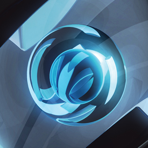
Microsoft Launcher Icon
This icon was created with Mobile & Merchandising Experiences (MMX) team. This icon was designed as part of the Microsoft Launcher re-brand, formerly known as Arrow Launcher. We gravitated towards shades of Blue as the base color to convey calm and open feelings.
Goals
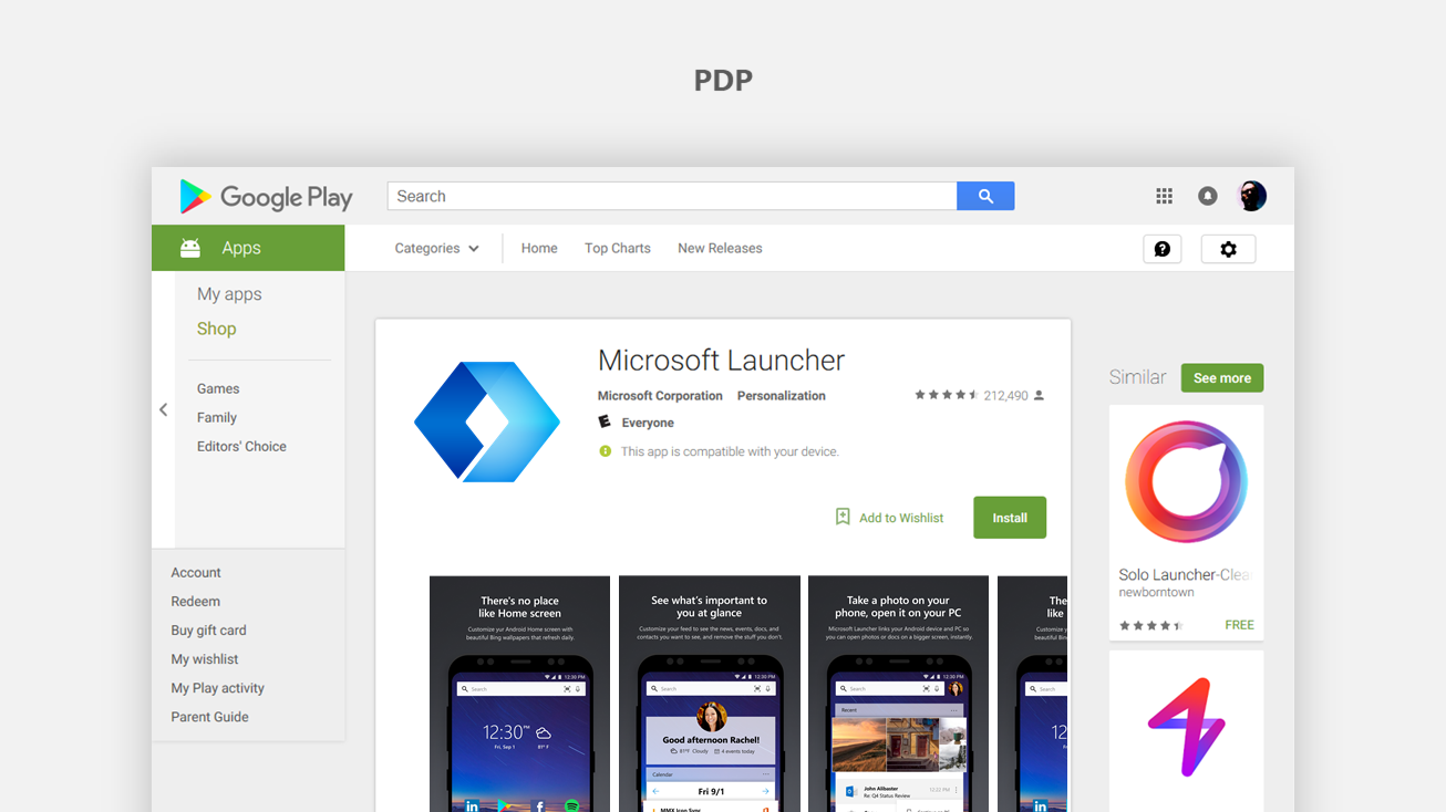
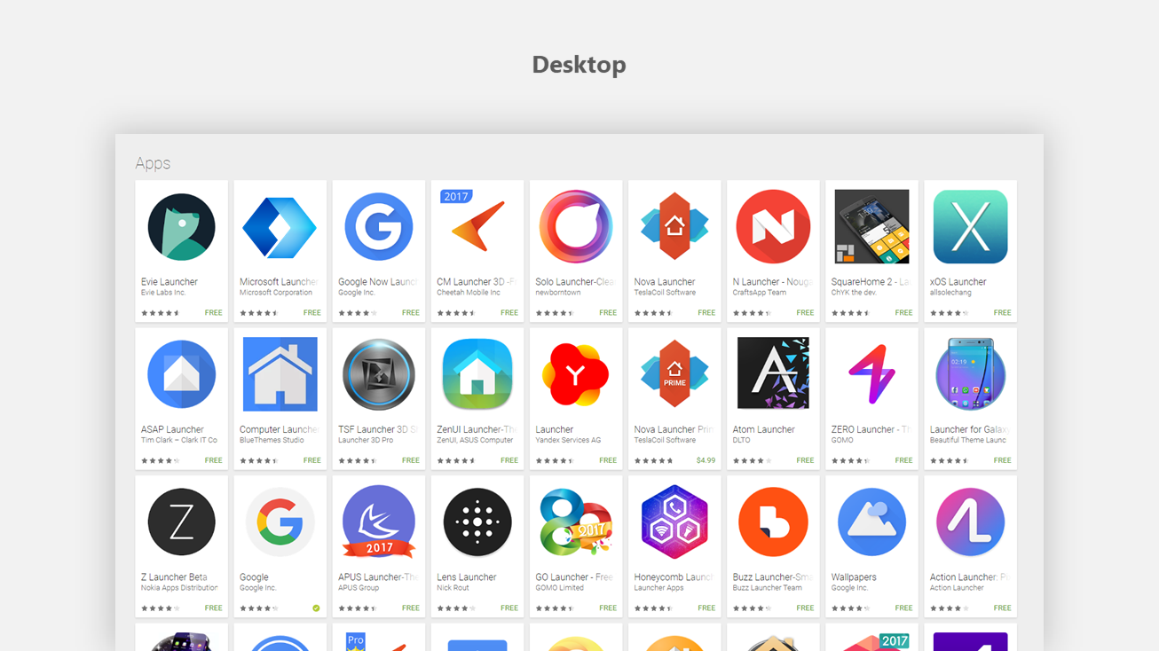
As the ambassador for Microsoft in the Google Play app store, our aim is to showcase the energy of the our brand.
Ultimately we want to differentiate and establish Microsoft Launcher as the premier launcher experience and the gateway to using Microsoft apps and services on Android phones and tablets.
Our team fully embraces the Fluent Design movement, and utilizing this well timed opportunity to execute on concepts and do some trailblazing on the path to shipping.
We hope to inspire people of action and creators to do more with Microsoft on the Android platform.
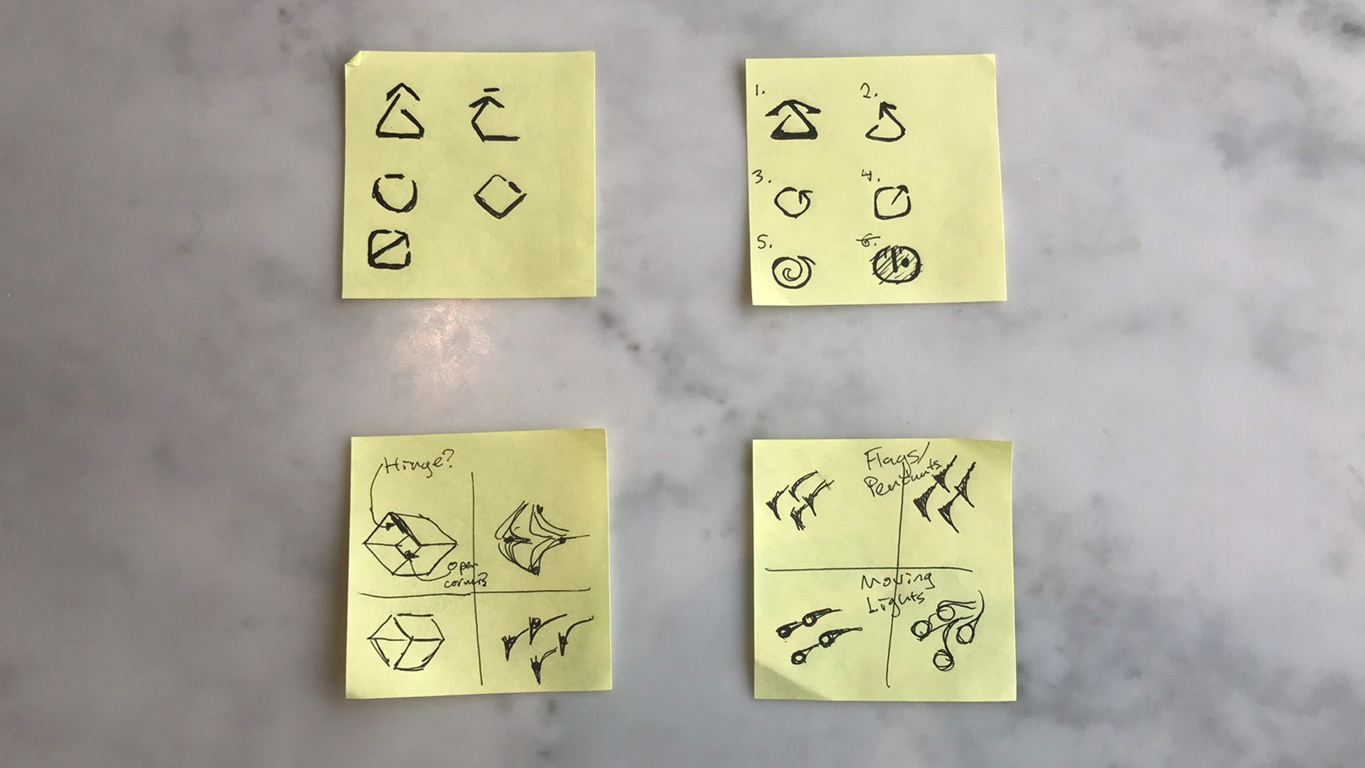
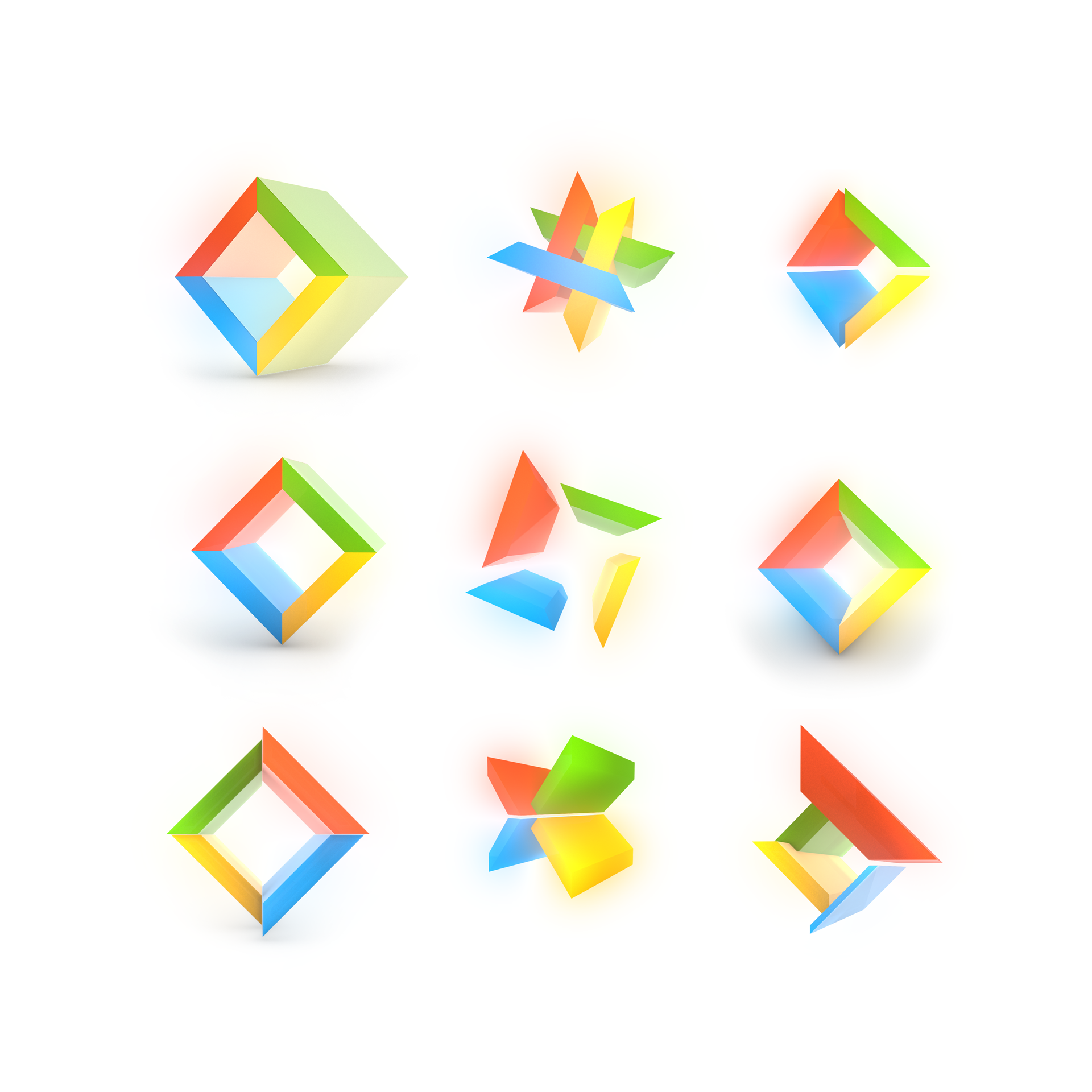
Sketches
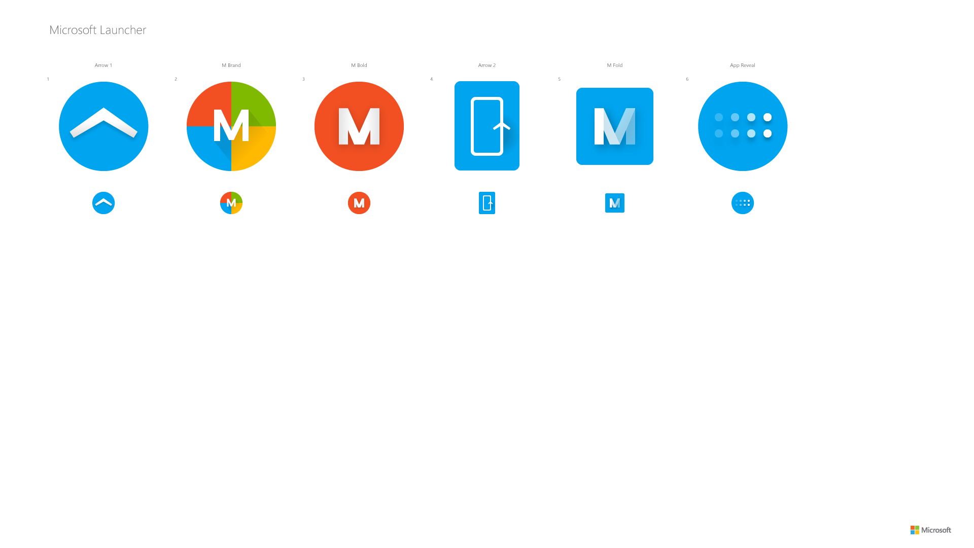
Design Phase 1: Explorations
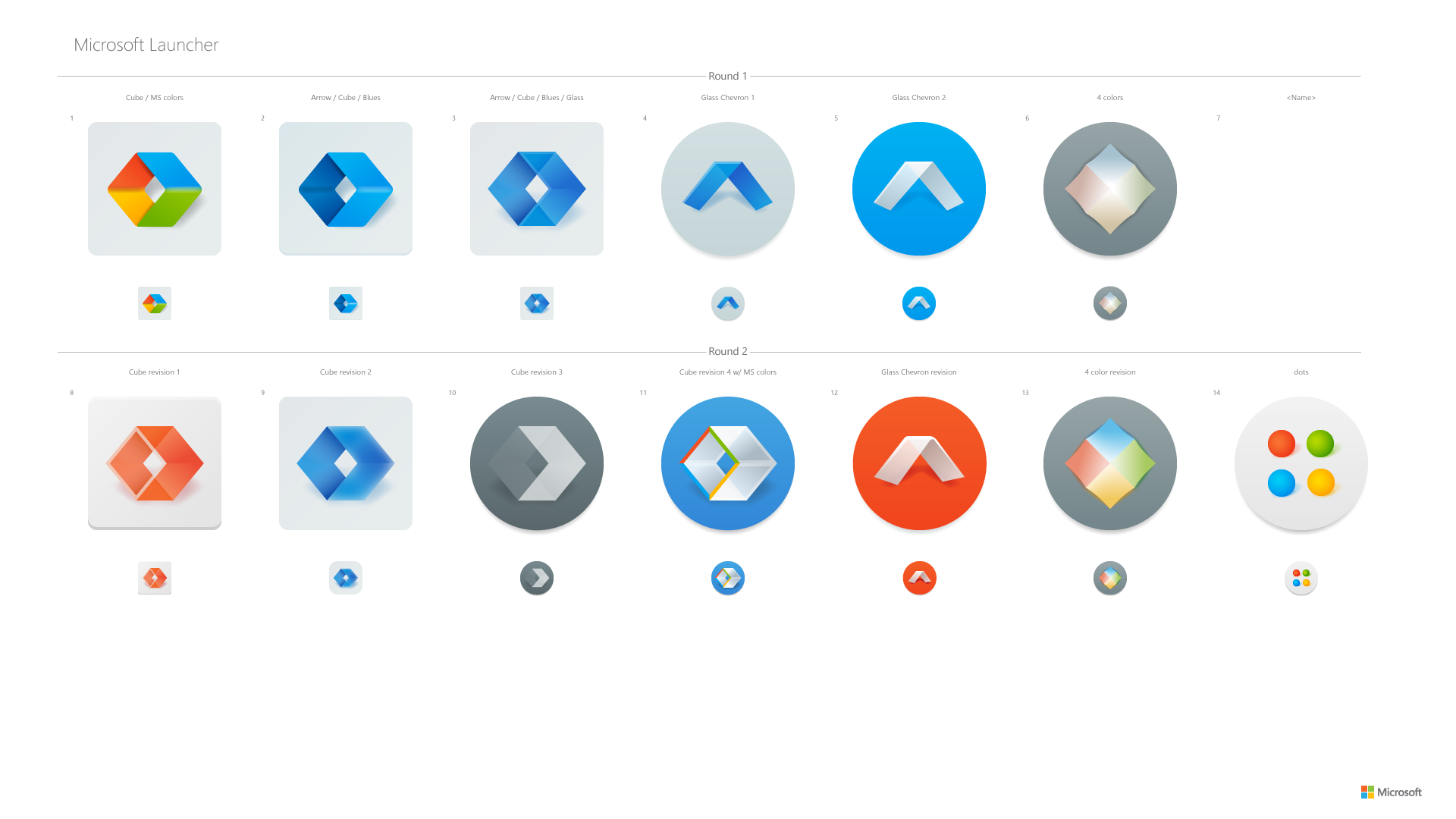
Design Phase 2: Collaboration
Design Phase 3: Refinement
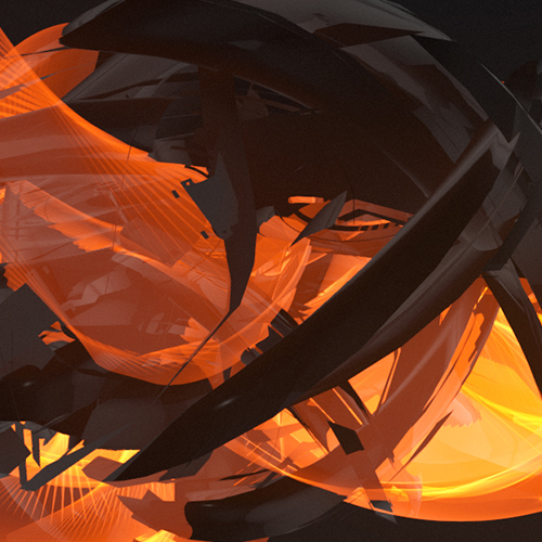
Design Phase 4: 3D/Fluent explorations
Almost final
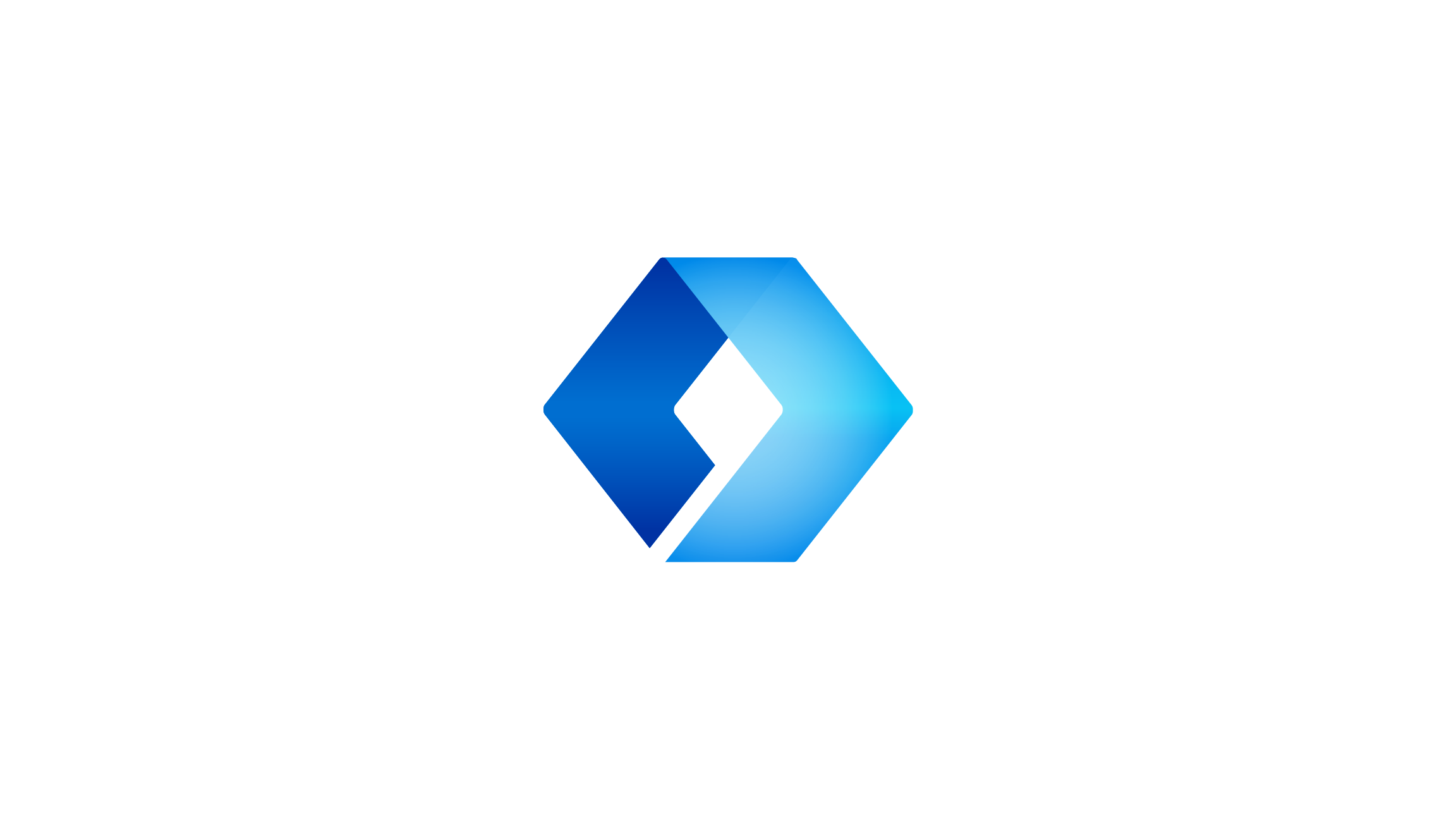
Final design
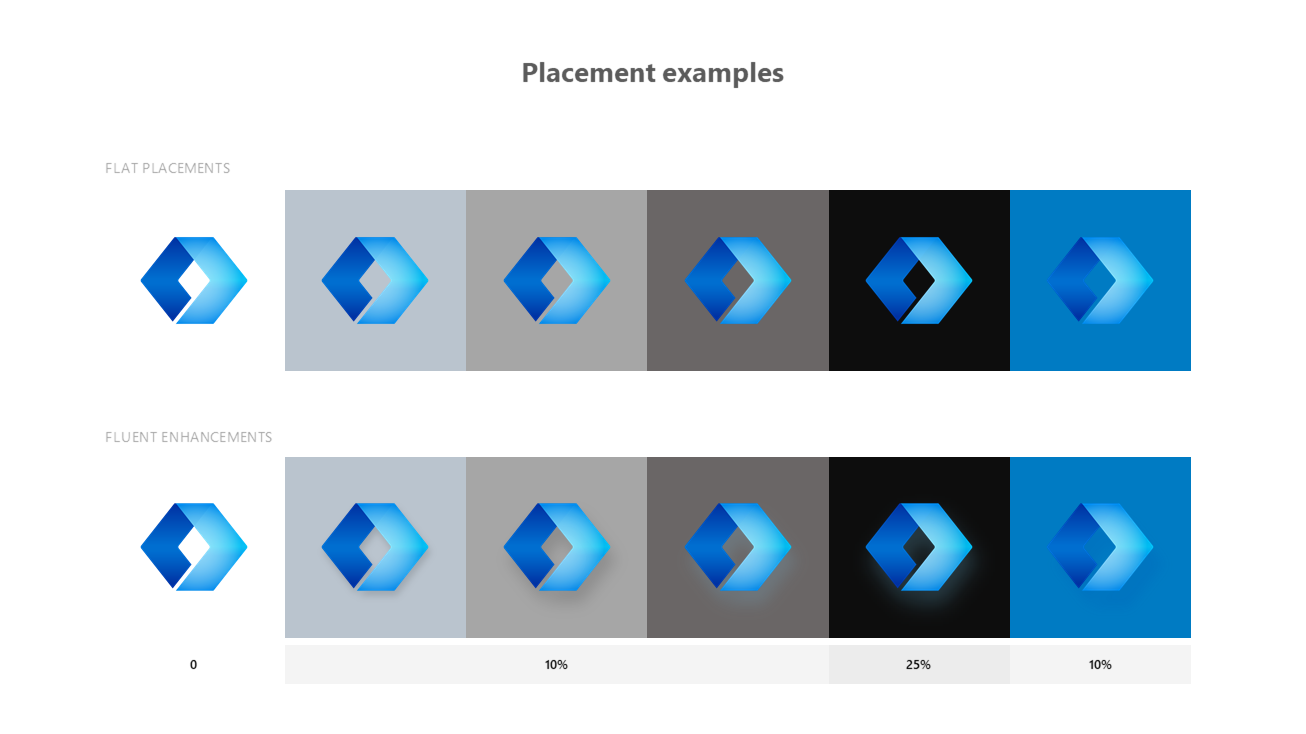
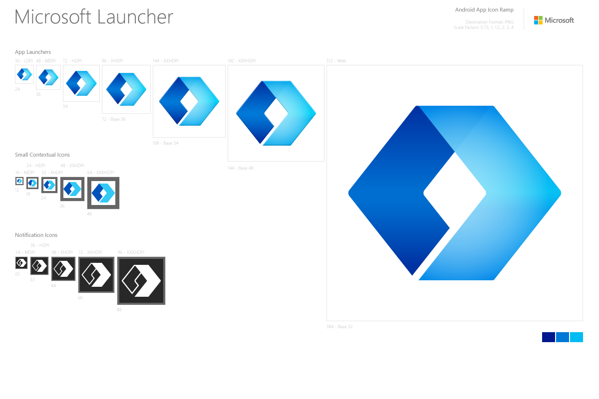
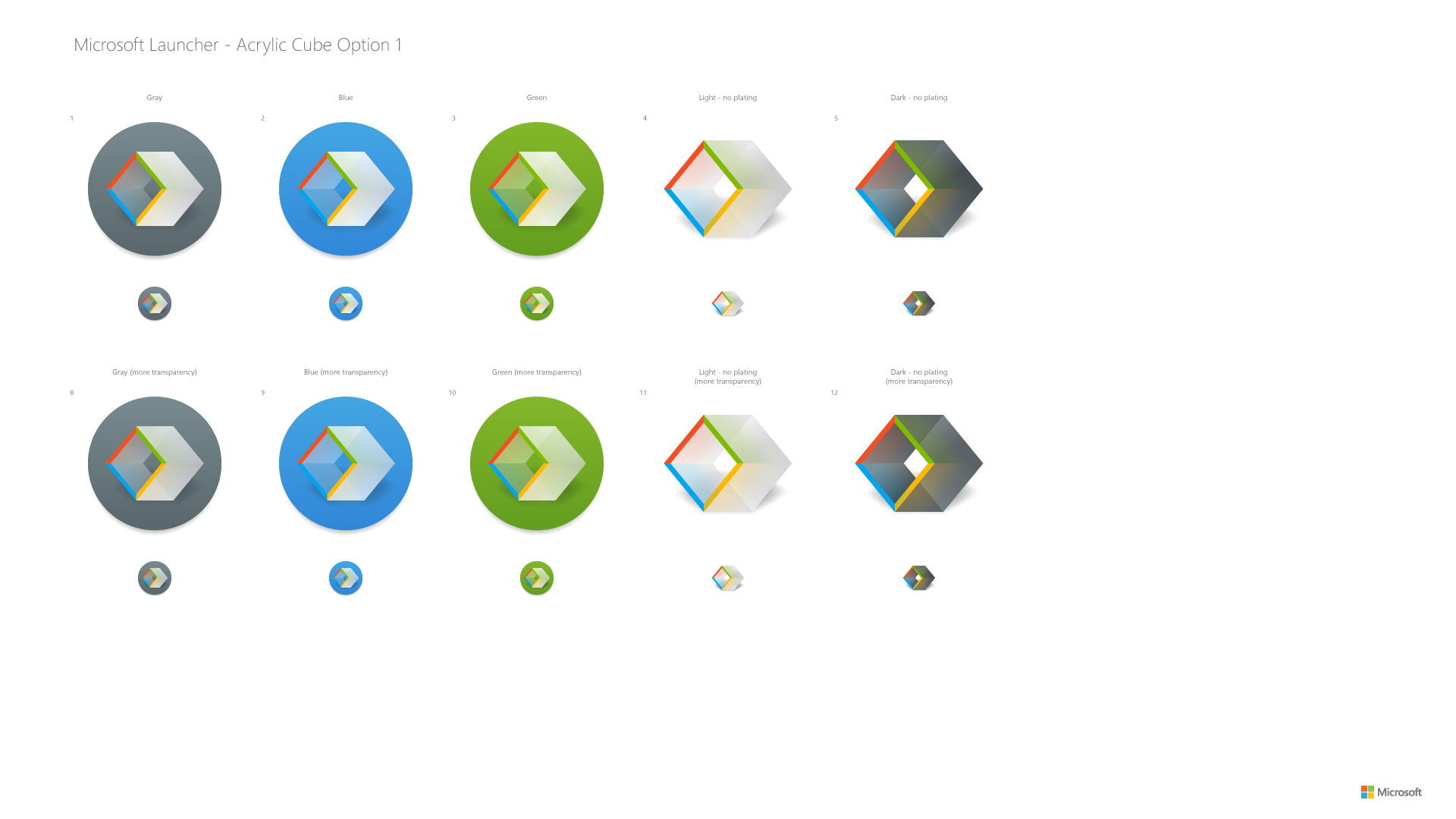
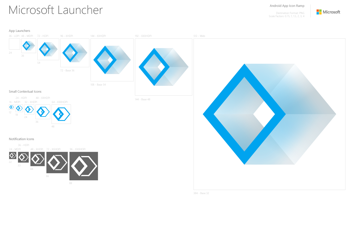
The extruded quadrangle is comprised of orthographic 3D geometry and incorporates several shades of blue from the Microsoft brand palette.
The quad form originally came about as a reflection of the squares found in the Microsoft logo. The translucent material represents acrylic, a key attribute of the Fluent Design System. The suggested forward facing arrow provides a hint of the original Arrow app icon, suggests moving forward and productivity across devices.
Close collaboration with the asset team was key to achieving consistent, high quality results which look great across screen sizes. My role was typically to lead the concepting efforts and guide the iteration process while working with many people across design, brand and product to get approval and final sign off.
As a team, we covered a lot of ground with over 75 concepts and variations before narrowing down to several simple, geometric forms for additional refinement and visual treatments.
The final form is based on a simplified orthographic projection of a cube with 2 faces removed. Visually the we wanted to suggest light moving through the shape and illuminating the outside, while slightly occluding the interior.
If I could go back in time and give myself suggestions on how to be more effective with this project I would have: explored 3D options sooner, created a real prototype of the logo (paper, 3d printed or otherwise), tried tracking design process and status on a wall or board in our space.
Featured porjects
Windows 10 OOBECorporate
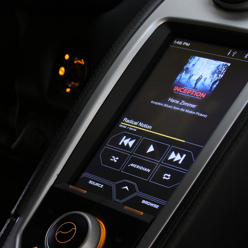
McLaren IRISCorporate
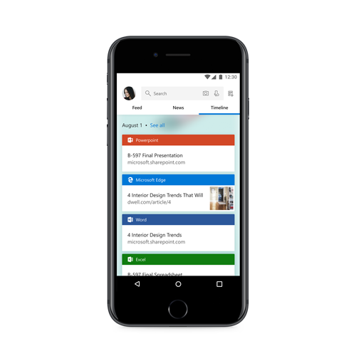
Timeline MobileCorporate

Microsoft Launcher IconCorporate Design
Gravitron EPPersonal
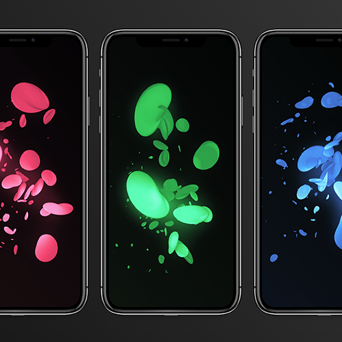
Mobile WallpapersExploration
3D ArtPersonal Projects